Raghav's mood board · presented 16 Jul

The Visual Direction

Three format routes for Bangalore Was Not Inevitable, each built against the same frame set on 2 July: 100 to 150 pages, a strong lean to hardbound, mixed paper stocks, engineer's-notebook dimensions in play. Each direction now carries its reference shelf: real books that prove the route works. Reviewed with the group on the 30 July call. Raghav is distilling the feedback into physical samples and aiming for an in-person session next week; the direction locks at that session.
Direction 01 / 03

The Field Notes

The honest document. A story about frontier work under constraint, told with the restraint of the era's own paperwork.

The Idea

A section-sewn paperback with french flaps, printed in black plus one spot colour on warm uncoated stock throughout. Design carries the production ambition: testimony set large and confident, the wit register running as vermillion marginalia, artefacts redrawn or reproduced as tinted duotones. The cover borrows the visual language of the bonded-warehouse form and the smallest ad in the Hindustan Times: typographic, stamped, unmistakably of 1985. Nothing glossy anywhere; the object feels like a well-made working paper that survived four decades.

Why It Fits This Story

  • Duotone treatment makes uneven archive photos look intentional; the design is immune to a thin photo haul.
  • Two-colour printing on uncoated stock is the same discipline the first batch worked under: hard things done well within limits.
  • Fastest to produce; lowest risk against the 30 Sept design freeze.

Watch Out

Least gift-able of the three at the BLF table; consider a flap-plus-band launch variant if this direction survives the production test.

The Shelf
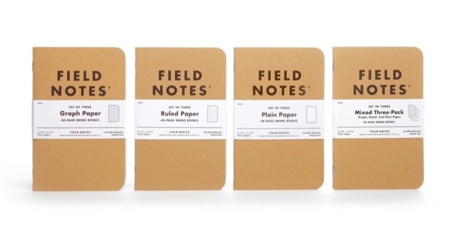
Field Notes kraft memo books
Field Notes · Draplin/Coudal
The utilitarian memo book elevated: kraft, graph grid, production specs printed as content. The baseline texture for a well-made working paper.
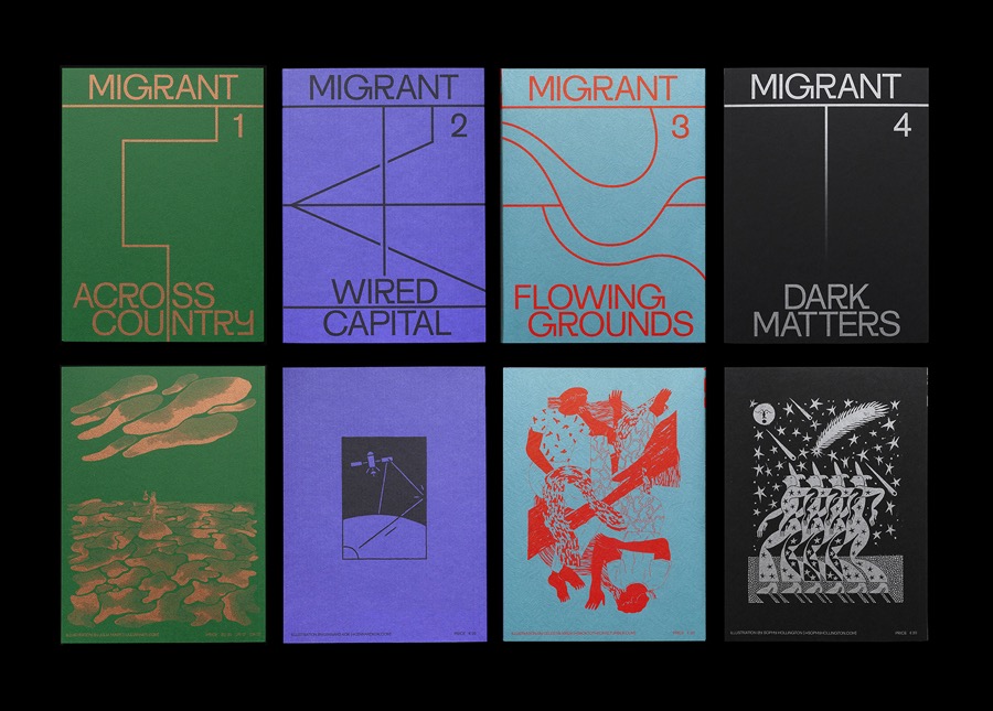
Migrant Journal spreads
Migrant Journal
One spot colour doing all the work over a disciplined grid: the exact economy of black plus vermillion. D&AD winner on two inks.
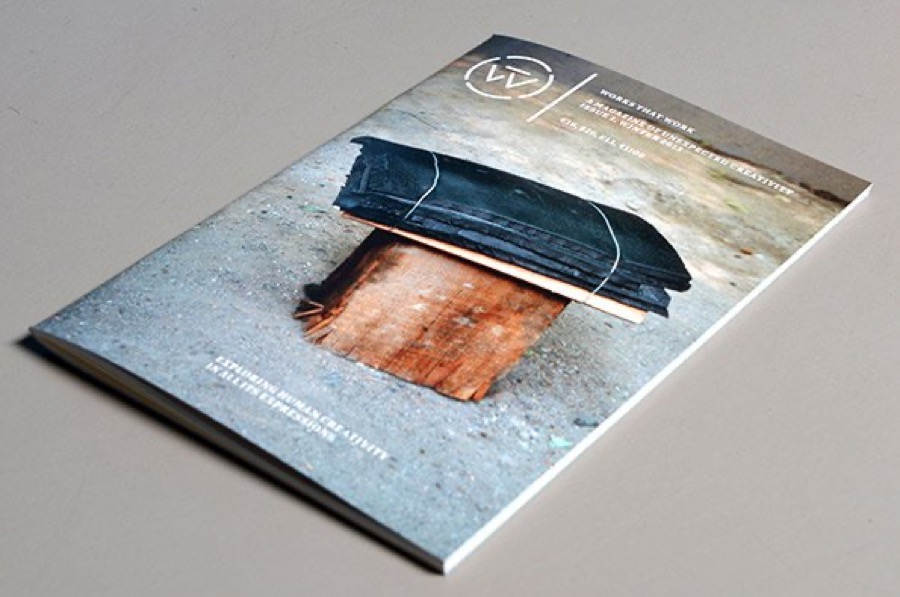
Works That Work magazine
Works That Work
Serious material on modest uncoated stock; creativity living inside constraint. Its thesis is literally the book's: jugaad married to rigour.
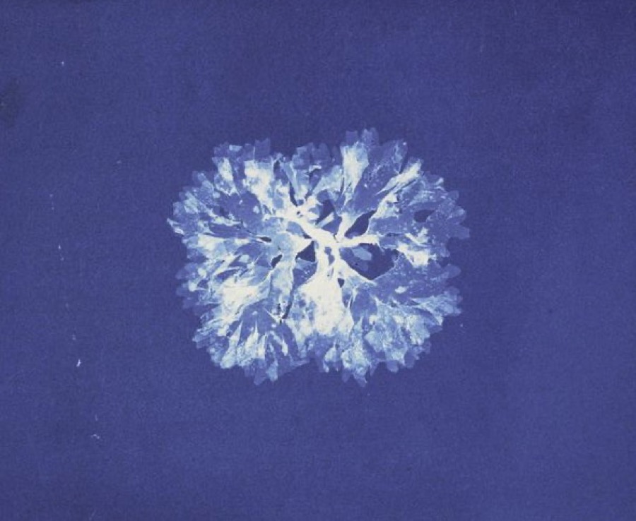
Anna Atkins cyanotype, 1843
Anna Atkins, 1843
A single ink making archive material feel intentional: the original blueprint book, and the argument for tinted duotones over an uneven photo haul.
Direction 02 / 03

The Company File

The dossier. TI India's own records, unearthed, adjudicated, and bound for the shelf.

The Idea

A hardcover that behaves like an institutional file finally opened. Two paper stocks choreograph the reading: warm uncoated cream for the oral history and narrative, and a single coated signature of photo plates for the Bangalore chapter and the artefact spreads. Endpapers reproduce facsimiles: the Hindustan Times ad, employee cards, the merge-map of mangled names. Chapter openers are styled as file tabs and permit headers, so the Licence Raj's own stationery becomes the book's navigation. Full colour only where photographs earn it.

Why It Fits This Story

  • The plate signature concentrates colour exactly where the open call delivers; Ch 10 is photo-led by design.
  • Endpaper facsimiles give funders' artefacts (Giri's red and blue cards, Sharada's drawer) a guaranteed home.
  • Hardcover durability suits the real audience: the first 300 employees' bookshelves, and their children's.

Watch Out

The plate signature is a bet on the photo archive; lock its page count only after the open call closes end-August, and hold a duotone fallback for weak images.

The Shelf

Off the Grid, Sara De Bondt
Off the Grid · De Bondt
Essays, interviews and a separate picture-plate section, each handled differently: the model for cream testimony stock plus one coated signature.
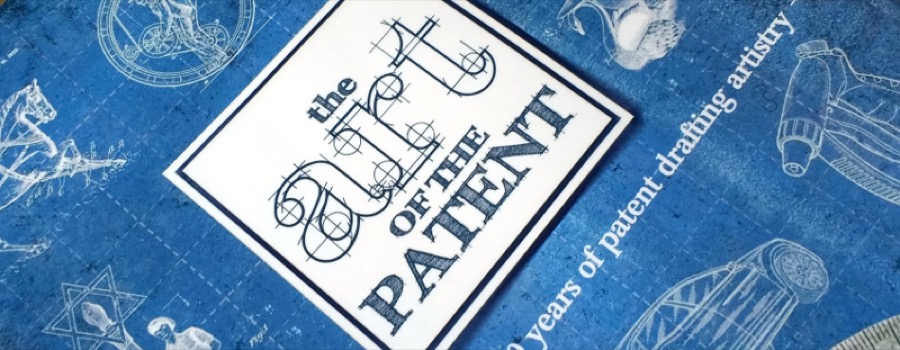
The Art of the Patent
Official drawing language: figure numbering, stamps, sectional cutaways. The stationery of the Licence Raj becomes the book's navigation.
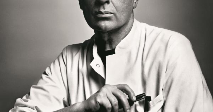
Gerhard Steidl at press
Steidl
What the plate signature must live up to: paper and ink chosen per image, blacks that sit almost in relief on uncoated stock.
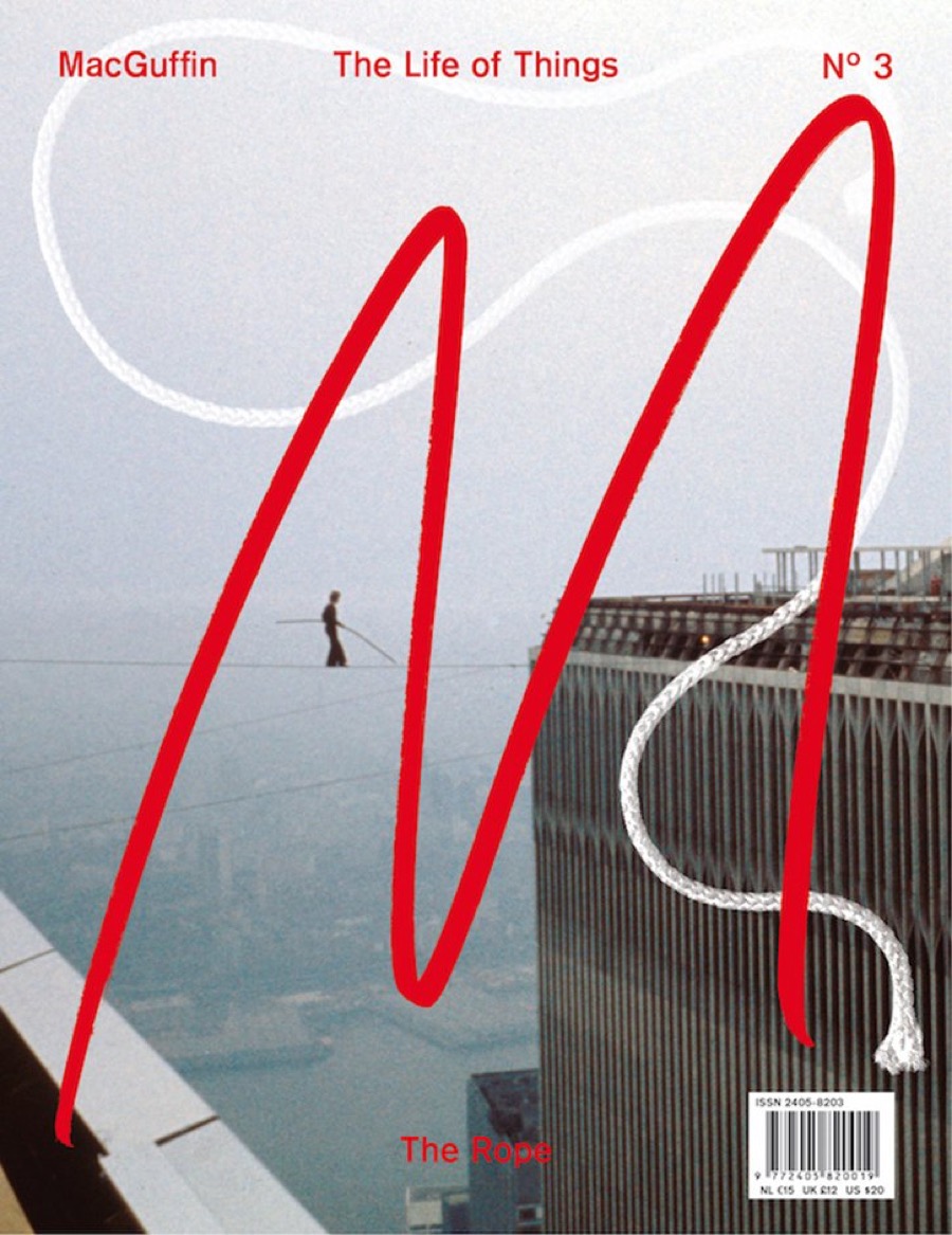
MacGuffin magazine
MacGuffin
A whole issue built around one ordinary object. How a dossier stays alive: every artefact (badge, form, merge-map) treated as a subject, not decoration.
Direction 03 / 03

The Artefact

The archive you can hold. Built for the first 300 employees, the funders, and the BLF table.

The Idea

A cloth-bound case with a foil-debossed satellite dish and no jacket; a belly band carries the title so the cloth stays quiet. Four stocks choreograph the whole arc: a tinted stock for the graphic-novel prologue, cream uncoated for testimony, coated plates for photographs, and a short coloured signature that isolates the epilogue, 756002, like a sealed record. Inside the back cover, a printed pocket holds a tip-in facsimile, an employee ID card or the first-export document, so every copy hands the reader a piece of the archive. Optionally numbered, 1 to 300, after the first batch.

Why It Fits This Story

  • The tip-in turns the funders' artefact hunt into the book's signature moment: the object literally contains the archive.
  • Stock changes give the graphic-novel prologue and the epilogue the staging the story spine already calls for.
  • A numbered edition of 300 mirrors the first 300 employees; the BLF launch gets a genuine collectible.

Watch Out

Cloth, foil and tip-ins add 2 to 3 weeks and need the October print slot booked now; the tip-in depends on the artefact hunt delivering one great scannable object by end-August.

The Shelf

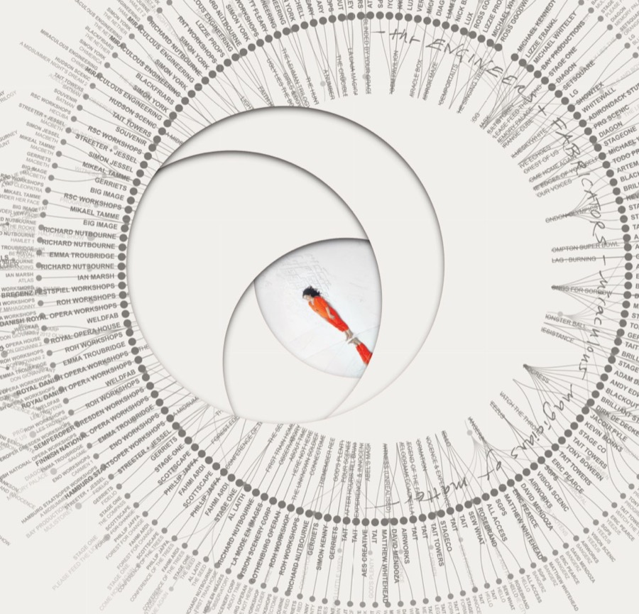
An Atlas of Es Devlin, die-cut aperture
An Atlas of Es Devlin
The book as sculptural object: concentric die-cut apertures that pull you through. The bar for "the archive you can hold".
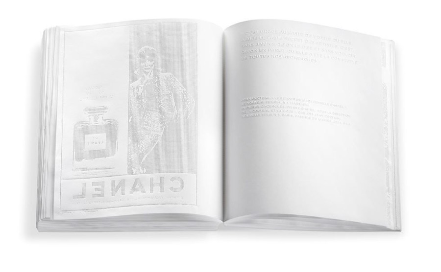
No.5 Culture Chanel by Irma Boom
No.5 Culture Chanel · Boom
Three hundred pages, zero ink, everything embossed. The quiet-cloth logic: the cover speaks in relief, the belly band carries the words.
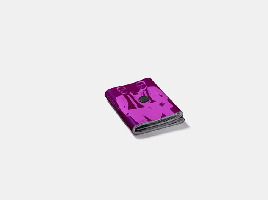
Viktor&Rolf Cover Cover by Irma Boom
Cover Cover · Boom
Binding and paper weight carrying meaning: thickest at the heart, thinnest at the edges. The reference for four stocks choreographing the arc.
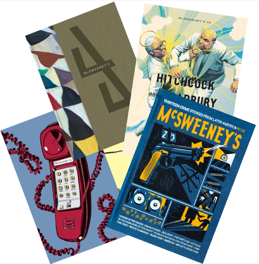
McSweeney's Quarterly Concern issues
McSweeney's
Maximal invention at the object level, typographic calm inside: the licence for the tip-in pocket and the numbered edition of 300.
Where this stands after the 30 Jul call

What We Leave With

Physical samples next

Raghav is distilling the group's feedback and curating physical samples for an in-person session in the week of 3 August. The direction locks there, not before.

Two formats confirmed

A collector's edition and a mass paperback designed for accessibility. Production comparisons and commercial decisions stay in the private project files.

Then, quotes

Specifications and reference books go to printers as soon as the direction locks; early quotes protect the 30 September design freeze and the print window behind it.

← Back to the 30 July record · Full reference bank: output/story/design-inspiration-references.md (30 sources, checked live 2 Jun)